by Sid Goel
I often get this question from various IT people: "Why do business analysts like fancy dashboards?"
I have a simple answer: it helps business analysts get a promotion. If you show your boss the same old visualizations (bar charts, pie charts, etc.), he or she will assume one of the following:
- You lack imagination
- You don’t really understand the data
- You are not helping your boss look good to their boss
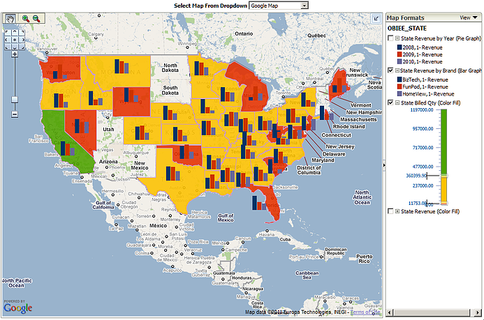
For example, you could show a Sales by State report as a bar chart or a pie chart. If on the other hand, you show your boss a Sales by State report using a map, you look imaginative, show that you understand the data and most importantly, make your boss look good to their own boss. Even better if the chart drills down to the zip code level.

Compelling data visualizations are quite simply the difference between buying a suit at discount outlet and buying an Armani suit from a high-end boutique. They do the following:
- They tell a story by navigating through the visualizations/data
- They enable faster decision making
- They enable more effective decision making
My advice to IT managers when talking to business analysts:
- Challenge the business analysts in your company to show the data in a more visually compelling way
- Show them the visualization capabilities of your current BI tool (most customers use 10% of any BI tools’ visualization capabilities)
- If you don’t have time in the current phase of the project, get a commitment from the business analysts to do compelling visualizations as a Phase 2
The Best Visualization I Have Ever Seen...
One of the best visualizations I have ever seen was in the Finance Department of one of our clients. Yes, Finance, the people who only want to see the numbers! It was a budget, actual and variance report where the multiple causes of the variance were shown as a waterfall chart.
For example: If a group of 5 cost centers were over budget, the advanced visualization would show the contribution of each of the 5 cost centers to the variance allowing the CFO to determine which cost center was the most over budget and speak to that cost center manager first while at the same time congratulating the cost center managers who were within budget.
This was a visualization that not only made decision making faster and more effective, it made the CFO look good to their boss, the CEO and the Board. It is pretty easy to visualize how the CFO will react to the next funding request from the CIO for a BI project.
 |
Sid Goel is a founding partner at KPI Partners. As a leader in the consulting industry, he has led hundreds of successful business intelligence, ERP, CRM, data integration, and cloud-based analytical projects. Check out Sid's blog at KPIPartners.com. |


